編排設計 | 字距微調,細節就在距離中
What is Kerning?
Kerning refers to the adjustment of space between two specific characters. Specifically, kerning involves adjusting the space between two adjacent characters to create a visually pleasing and balanced appearance of the overall text. The objective of kerning is to ensure that the spacing between each pair of characters is visually consistent and harmonious, which can improve the legibility and readability of the text. Kerning is the key to achieve balanced typography.
 |
Why Proper Kerning is Important
Proper kerning is essential for improving the legibility, readability, and visual appeal of your text. Here's how:
Enhances Legibility: Kerning can improve the legibility of text by ensuring that the spacing between individual characters is consistent and visually balanced.
Improves Readability: Proper kerning can improve the overall readability of text by making it easier for readers to distinguish between individual characters.
Enhances Visual Appeal: Kerning plays a crucial role in enhancing the overall visual appeal of typography, creating a more polished and professional appearance.
Helps Create Hierarchy: Kerning can be used to create visual hierarchy within text, making certain words or phrases stand out more than others.
Conveys Emphasis: Proper kerning can also convey emphasis or emotion within text, helping to communicate a specific tone or mood to readers.
How to Achieve Balanced Typography with Kerning Techniques
Here are some techniques and key points to keep in mind:
Understand Kerning: Kerning involves adjusting the spacing between specific pairs of characters to improve readability and aesthetics. It helps create harmonious and balanced typography.
Use Optical Kerning: Many design software and typography tools offer optical kerning, which automatically adjusts the spacing between characters based on their shapes and proportions. It is a good starting point for achieving balanced typography.
Manual Kerning: While optical kerning is convenient, manual kerning provides greater control and precision. Carefully examine each character pair and adjust the spacing as needed to create even visual spacing and eliminate awkward gaps or collisions.
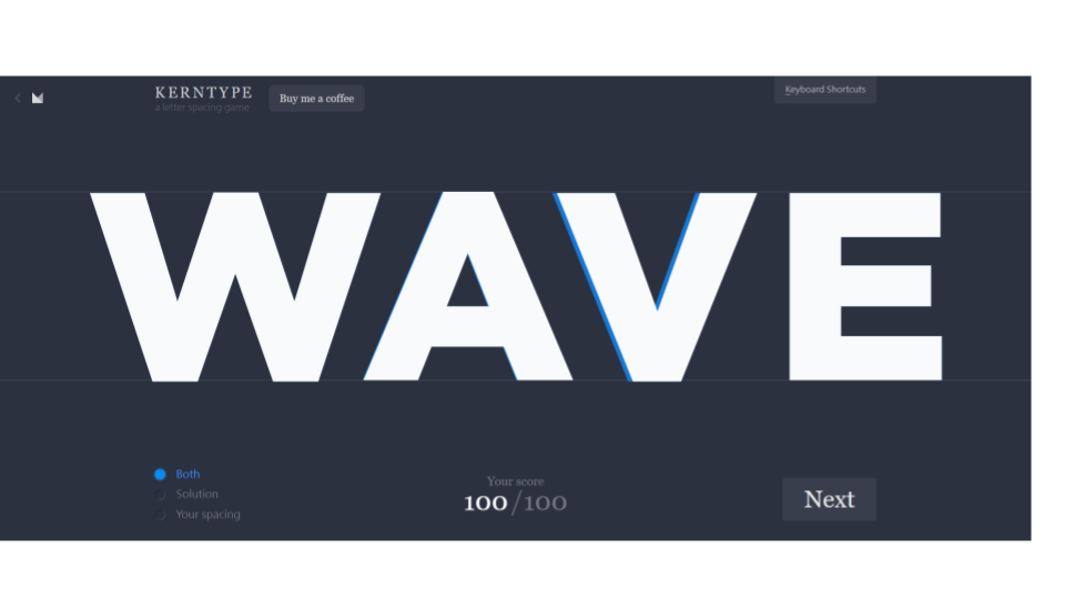
Focus on Letter Combinations: Pay attention to specific letter combinations that often require kerning adjustments, such as AV, AW, VV, WA, YA, etc. These combinations may have irregular or awkward spacing by default and need careful attention.
Adjust Problematic Pairs: Certain character combinations tend to create visual issues, such as large gaps or collisions. Examples include AV, LV, To, Wo, etc. Manually adjust the spacing between these pairs to improve readability and visual balance.
Consider Context: Take into account the overall context of your typography, such as the font style, size, and layout. Kerning adjustments should be made to maintain consistent spacing and ensure harmony throughout the text.
Test at Different Sizes: Kerning adjustments that look appropriate at one size may not work well at smaller or larger sizes. Test your typography at various sizes to ensure optimal readability and aesthetics across different applications.
Compare and Iterate: Continuously compare your kerning adjustments with the original spacing and other characters. Strive for consistency and make iterative refinements until you achieve a visually pleasing and balanced result.
Seek Feedback: Share your typography with peers or professionals and gather feedback. Others may spot issues or provide valuable suggestions for further improving the kerning.
By applying these typography kerning techniques and keeping these key points in mind, you can achieve well-spaced and visually appealing typography that enhances readability and overall design quality.
Put it into practice.
Learn Kern with Kern Type - A letter spacing game
If you want to improve your kerning skills, try Kern Type, a free online game that tests and improves your kerning skills. Players are presented with a series of words and must adjust the spacing between each letter in a word to achieve perfect kerning. The game includes various difficulty levels and provides feedback on the accuracy of the player's kerning, making it a great way to learn about typography. Start learning Kerning with Kern Type today!
 |
| Kern Type - A letter spacing game |
