Fonts| 字體選擇很重要,慎用特色字體!
When it comes to typography, there are certain font families that designers generally do not recommend due to their overuse or lack of visual appeal. Here are some font families that designers often advise against using:
Comic Sans: This font is notorious for its informal and playful appearance, which makes it unsuitable for most professional or formal design projects.
Comic Sans / 似手寫、漫畫字體
 |
| Source : Wikipedia |
Papyrus: Papyrus is known for its exotic, ancient look. However, its frequent use in inappropriate contexts, such as for restaurant menus or movie posters, has led to its reputation as an overused and cliché font.
紙莎草紙 / 古風、異國情調字體
 |
| Source : Wikipedia |
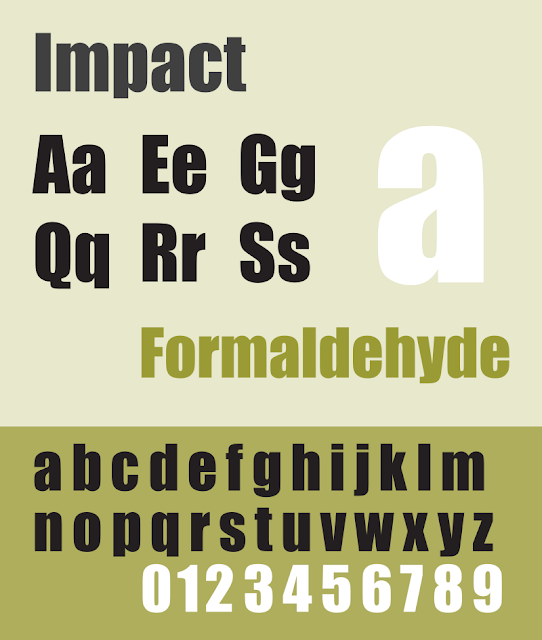
Impact: Impact is a bold, heavy font that can be difficult to read when used in large blocks of text. It is often considered too overpowering and lacks versatility.
Impact / 字體粗獷、x字高大字體
Curlz MT: Curlz MT is a decorative font with exaggerated curls and swirls. While it may be suitable for certain design themes, it is generally seen as childish and unprofessional for most applications.
Curlz MT / 波浪筆劃、漩渦裝飾性字體
 |
| Source : Wikipedia |
Brush Script: Brush Script is a script font that imitates handwriting with brush strokes. It is often criticized for its outdated and cliché appearance, making it less suitable for modern design projects.
Brush Script/ 似手寫字體
 |
| Source : Wikipedia |
Algerian: Algerian is a decorative font that imitates the look of engraved lettering. Its elaborate design can make it difficult to read in small sizes and may appear outdated or excessive in many contemporary designs.
Algerian / 裝飾性字體
 |
| Source : Wikipedia |
Remember, the suitability of a font family ultimately depends on the context and purpose of the design project. These font families are simply examples that are commonly discouraged due to their overuse, lack of legibility, or outdated appearance.
